
Every year, leading design agencies and companies specializing in colors choose their color of the year. While last year warm earthy and coral tones were in fashion, this year it seems that cool blue and turquoise shades with a cool undertone have taken the lead. In 2024, we will most often wear various shades of blue. However, among them, there is also a warm color that will surely warm you this winter.
Blue with a Purple Hue
The main color of 2024 according to Benjamin Moore, known for its paints and color solutions, is a rich blue with a purple undertone called Blue Nova. This color is perfect for those who want to stand out and are not afraid to choose more dramatic shades in both clothing and interior design.
In clothing, it is recommended to pair it with more neutral tones such as gray, cream, and pale pink.
Moreover, this color harmonizes beautifully with warm bright shades, such as orange. This combination highlights the best in both colors — the depth and severity of blue and the optimism of orange.
Bright Apricot
According to color experts at WGSN, the main color of 2024 is the bright and uplifting Apricot Crush. Following the trend of peach notes in perfumery, the apricot color has also arrived, which is especially pleasant during the gray winter months.
This shade lies between orange and yellow, colors that symbolize sunlight, optimism, and calmness. It is no surprise that it instantly lifts the mood for both you and those around you. Pair this color with purple, blue, and turquoise shades.
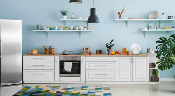
Soft Blue
The color of 2024, named by C2 Paint as Thermal, is a gentle calming shade of blue reminiscent of a clear spring sky. “Thermal reminds us of the endless variety of blue shades that nature offers to restore our mood,” notes Philippa Radon, interior designer and color specialist at C2.
This color is bright yet soothing, making it an excellent choice for both clothing and interiors. It looks great in kitchen cabinets, on bedroom or office walls. Due to its contradictory nature, this color can simultaneously uplift the mood and create an atmosphere of tranquility.
Bright Blue
The paint manufacturer Krylon has chosen the shade Bluebird as its color of the year — a color whose hues can be seen in the feathers of the Indian roller. This color evokes the summer sky on the hottest day and, despite its cool undertone, seems to physically warm you.
This bold shade of blue is pleasing to the eye, but it should be used in moderation and paired with neutral colors. If you choose it for clothing, let it be one bright accent in the outfit, while the other details remain in muted tones.
“Bluebird brings joy and satisfaction [when used in interiors], supporting consumers' desire for 'dopamine decor,'” says Ashley Banbury, color marketing manager at Krylon. Dopamine is the hormone of anticipation of pleasure and reward, which invigorates and helps achieve goals.
According to Banbury, Bluebird is a welcoming color that easily pairs with both warm and cool shades, helping to balance more subdued colors in the interior, as well as vintage furniture and other 'non-modern' elements.
Muted Turquoise
The paint selection and manufacturing company Valspar has chosen Renew Blue as its color for 2024. This is a muted turquoise or aquamarine. Its most accurate description is the color of sea waves with a hint of gray.
Using this color in both interiors and clothing helps to recharge energy and instill a sense of confidence and calm. This shade is so versatile that it can be used as an accent in interiors without fear of it becoming tiresome or going out of style. Similar colors were popular in the early 2000s — for example, the color of the year according to Pantone in 2003 was a very similar Aqua Sky. And it is still relevant.
“Inspired by mist, drizzling rain, clouds, and glacial lakes, Renew Blue lifts the spirits, encourages self-expression, and creates a sense of balance and calm, while also providing a touch of spontaneity,” explained Sue Kim, color marketing director at Valspar.


Leave a comment