
Color in clothing is not so much about literal adherence to trends as it is about emotional qualities: clarity, balance, softness, and strength at the same time.
This year, leading designers and street style gurus suggest building a wardrobe thoughtfully, with taste and mature aesthetics. Here are five shades that are truly worth having in your arsenal — stylist Masha Vedernikova shared the details.
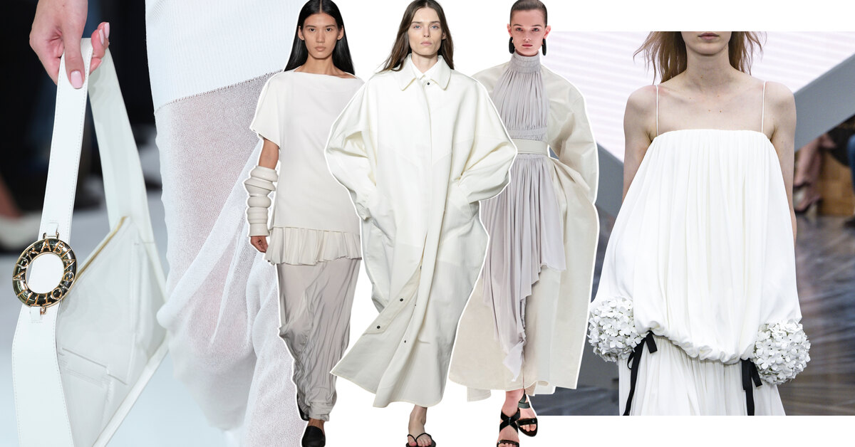
Cloud White
This is not a sterile and therefore boring white — cloud white looks soft, almost tactile, as if it contains air and light. "It creates a sense of calm, purity without austerity. This white is perceived as a modern alternative to beige and cream shades, but sounds fresher and more intellectual. In 2026, it is associated with silence, slowing down, and a new form of luxury — unobtrusive and very confident. Moreover, it is the color of the year according to Pantone," says the fashion expert.
Poppy Red
Bright, dense, emotional — poppy red brings back the color as a stylish gesture. It is not aggression or provocation for the sake of a striking effect, but the energy of life and strength. It is associated with confidence, mature boldness, and the ability to stand out without seeking reasons or conditions. Unlike the wine and burgundy tones of previous years, poppy red sounds cleaner and, of course, brighter, which is why it looks so interesting.
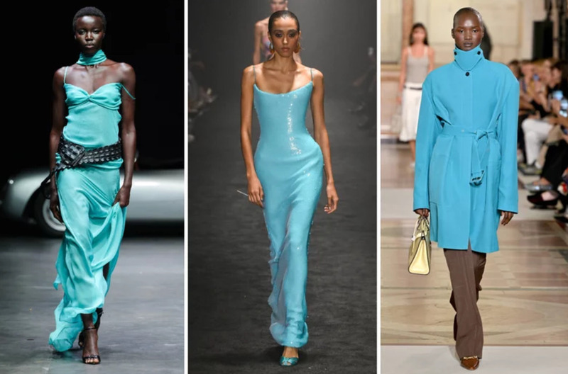
Dusty Blue
This shade seems to have been filtered through the lens of time. It is neither cold nor naive, but calm and slightly detached. "Dusty blue creates a sense of distance and clarity, associated with intellect, observation, and inner stability. In 2026, it works as a color for those who do not seek unnecessary agitation but know exactly where they stand — primarily, emotionally," emphasizes the stylist.
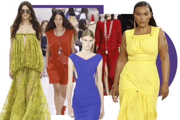
Pastel Yellow
Soft, light, almost sunny — pastel yellow becomes the color of quiet joy. It is not optimism on display, but a feeling of warmth and lightness that requires no explanation. It is perceived as an emotional anti-stress, as light on a gray day. This year, the shade embodies the feeling of life without tension, of calm pleasure, and the ability to enjoy simple things.
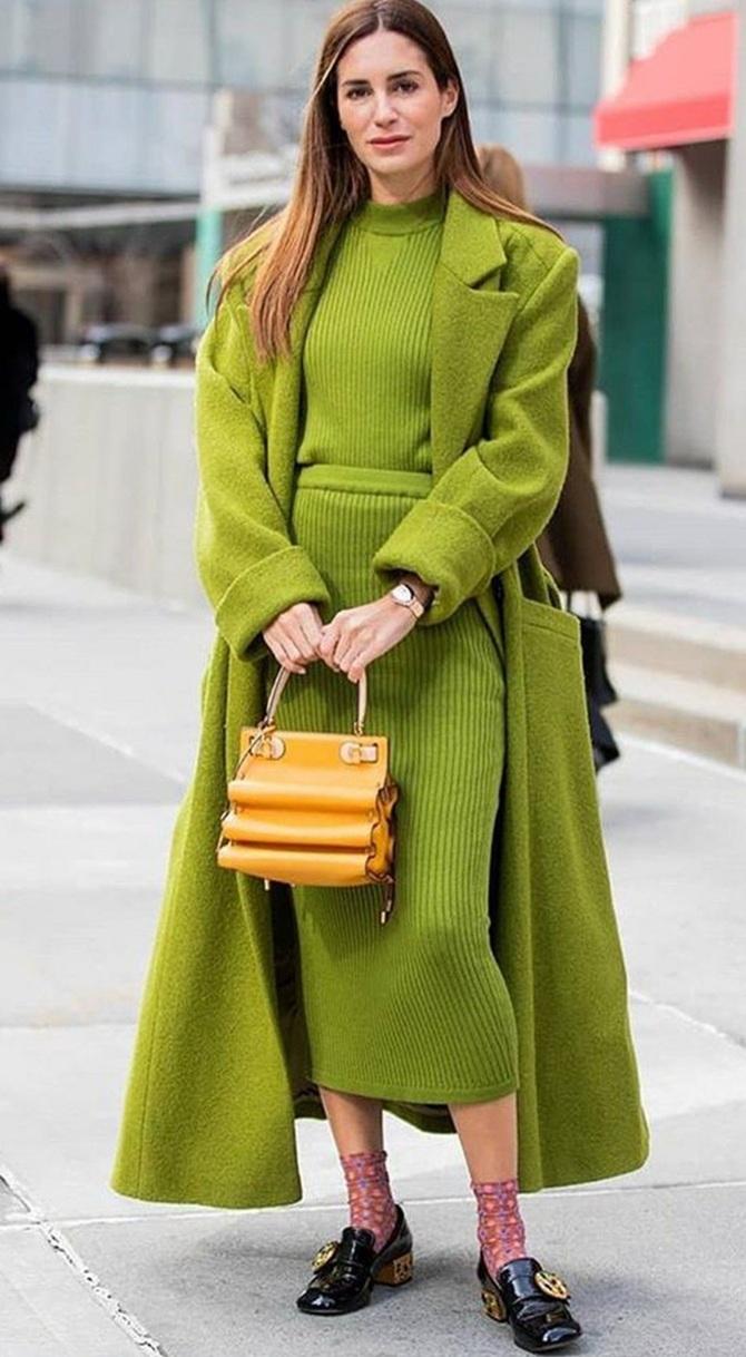
Chartreuse
The boldest and simultaneously life-affirming color of the palette. Chartreuse is movement, risk, and a visual challenge. It balances between green and yellow, creating a sense of energy that does not fit into conventional frames. This color is chosen not for comfort, but for the feeling of triumph — after all, a person dressed in such a bright shade is quite hard to miss. And it is impossible not to be impressed by their boldness and desire to showcase themselves fully.


Leave a comment