In 2026, the approach to color in interiors has become more conscious: designers are moving away from random decisions and focusing on complex shades, natural combinations, and thoughtful accents. The emphasis is on comfort, visual calmness, and harmony in the space.
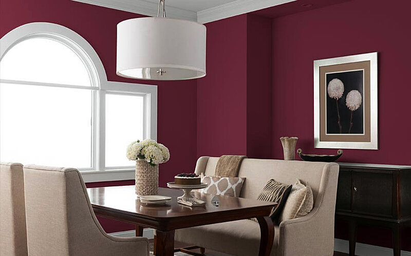
Deep Wine: Richness Without Overload
One of the main accents of the season has become dark wine shades. They add depth to the interior and make the space more cohesive and expressive.
Such colors are most often used in moderation:
- for an accent wall in the living room
- in textiles — curtains, cushions, bedspreads
- in upholstered furniture
It is important to maintain balance: one expressive element is enough to create the desired effect. Wine shades pair especially well with warm light and natural materials.
Terracotta and "Raw" Natural Shades
The trend is everything that looks as natural as possible: shades of clay, earth, rust. These colors create a sense of coziness and a "living" space.
They are used:
- for walls with a matte texture
- in kitchen or bathroom tiles
- in ceramics and decorative elements
These shades reveal their best qualities when combined with wood, linen, and stone. Designers advise avoiding gloss — matte surfaces look more modern.
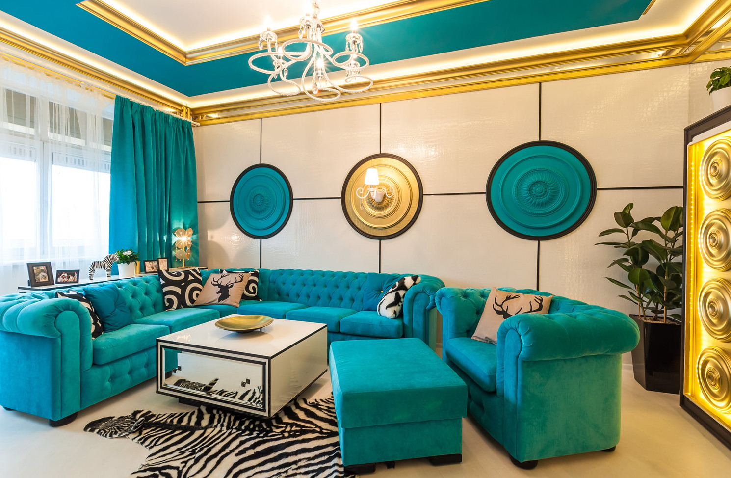
Blue-Green Palette: Versatility and Calm
From turquoise to deep sea shades — the blue-green palette remains one of the most versatile.
Its advantages:
- easily adapts to different styles
- changes depending on lighting
- creates a balance between freshness and calmness
Such shades are suitable for kitchen fronts, bathroom walls, or large furniture. They help create a harmonious space without excessive brightness.
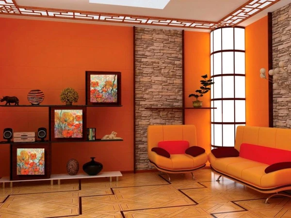
Bright Accents: Lime, Neon, and Electric
Bright colors have not disappeared but are used sparingly. Acidic shades, lime, and electric blue are in fashion, but only as accents.
They are applied:
- in a single piece of furniture
- in decorative elements
- in textiles
Even a small detail can enliven the interior, so it is important not to overload the space.
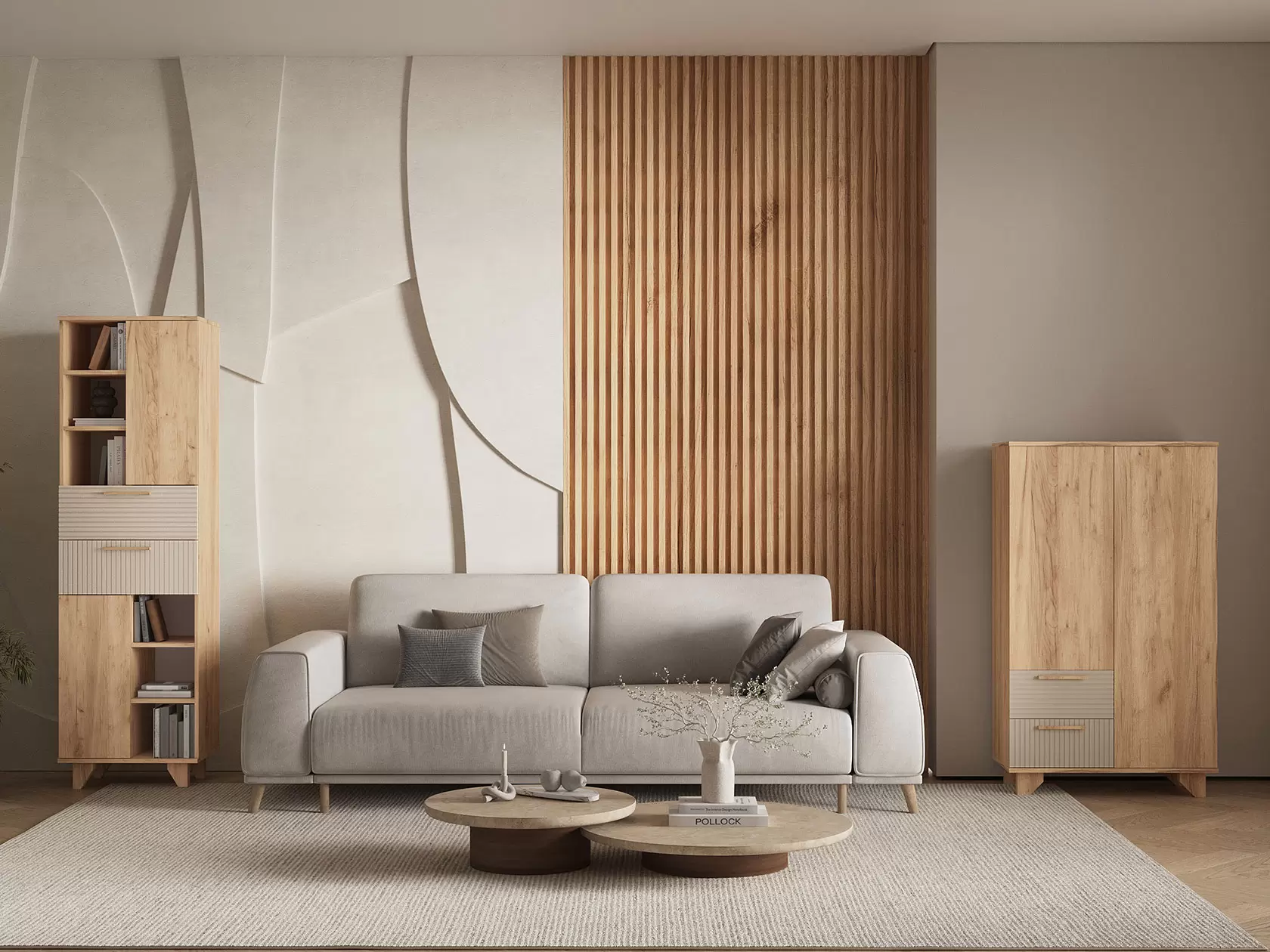
Warm Neutral Base
Base colors remain but become softer and warmer. In 2026, popular choices include:
- creamy white
- warm gray
- muted green
- beige shades with a natural undertone
Such a base creates a sense of stability and coziness, allowing for easy addition of accent colors without the risk of overwhelming the interior.
Metals and Temperature Contrast
In the interior, there is a growing interest in the combination of warm and cool. Against the backdrop of natural materials, metallic elements — chrome, steel, nickel — are increasingly appearing.
They are used in:
- lighting fixtures
- hardware
- furniture elements
The temperature contrast makes the space more dynamic and modern.
How to Properly Combine Colors
Experts recommend following a simple scheme:
- base — calm neutral shades
- one main color
- several accents
This approach helps create a harmonious interior without clutter. It is also important to consider lighting: the same color can look different depending on the light.
...Interiors in 2026 are becoming calmer and more thoughtful. The focus is on complex natural shades, soft base solutions, and pinpoint accents.
The main idea of the season is not the number of colors, but their quality and combination: the space should not only look stylish but also create a sense of comfort and inner balance.